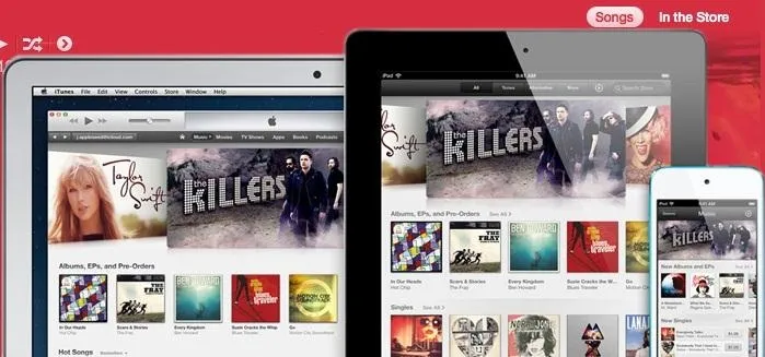
After a two-month delay, Apple has finally released iTunes 11, which was initially slated to be released alongside iOS 6.
The new highly revamped music player is a substantial upgrade from the old version, but that isn't really saying much; iTunes has never really had a great footing with users due to shitty features, an ugly user interface, and very laggy navigation, among other things.
Remember Ping? Yeah, me neither.
Although it's not perfect, iTunes 11 has many great new features, including Up Next, the more integrated iCloud, and Expanded View.
The "Up Next" Playlist
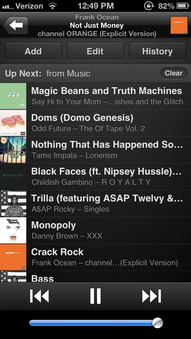
One of the most talked about new features in iTunes 11 is called Up Next. This combination of playback history and playlist-of-sorts allows users to not only see what song will play next, but to control it as well.
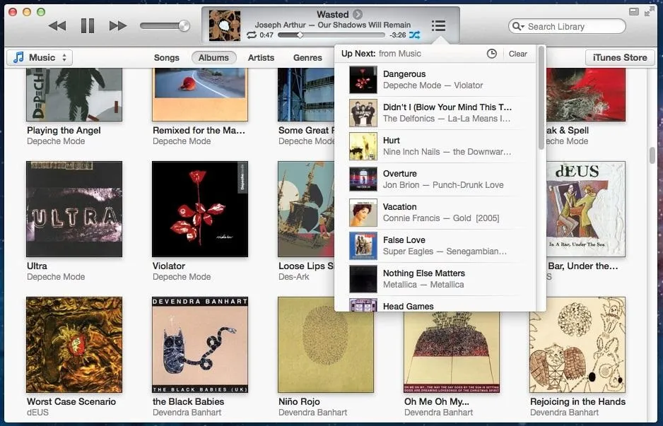
To put a song (or album) in the Up Next list, all you have to do is hover your mouse over the song or album title you want, click on the small arrow icon, and "Add to Up Next".
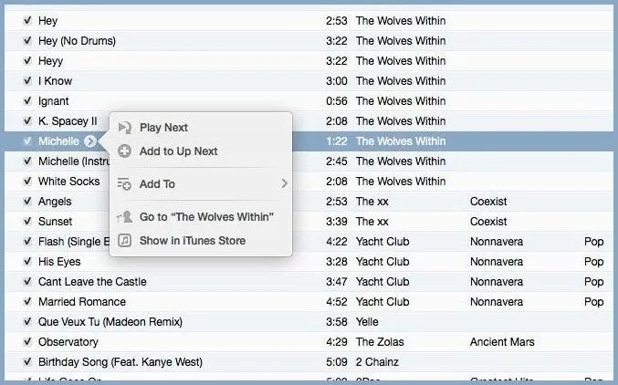
To navigate Up Next, click on the three-line playlist icon located in the song viewer at the top. From there, you can rearrange and delete the songs to your preference.
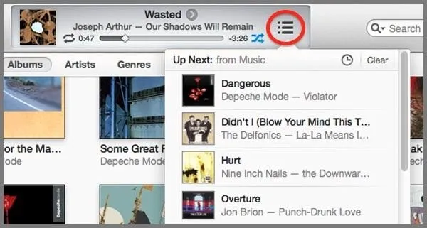
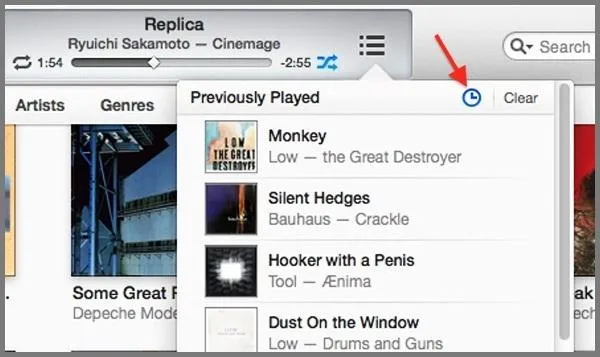
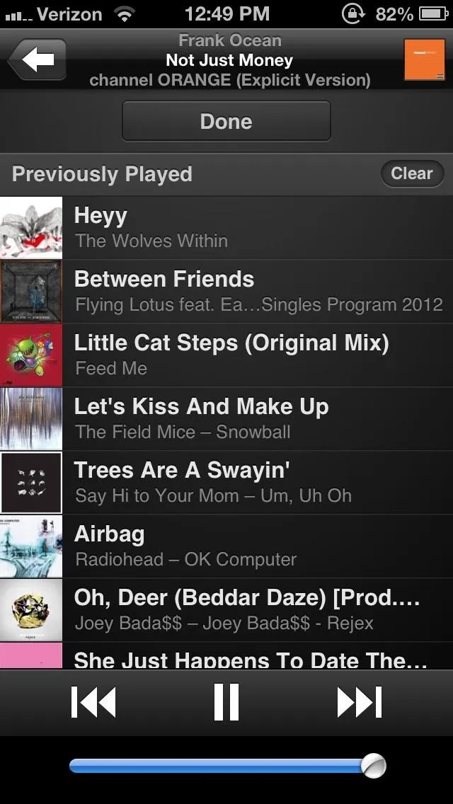
You can also click on the small clock icon in Up Next to toggle between what's coming up next and your previously played history.
Better iCloud Integration
While we've had iCloud capabilities in iTunes for a while, it's never been integrated so deeply. You can now access your content on all of your devices by going to the "Preferences" menu, clicking "Store," and selecting all of the items you want to sync.
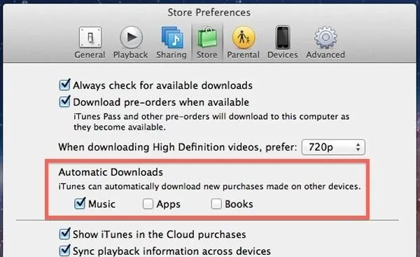
Whenever you buy an album, song, movie, or TV show (on any device), you can instantly access it on your iTunes library through your computer. You can even access files offline by simply clicking the new Download button.

Move Over Cover Flow, There's Now Expanded View
The very ugly and choppy Cover Flow has now been replaced with Expanded View. Tapping on the album thumbnail should show you a sleek listing underneath, with all of the songs in it.
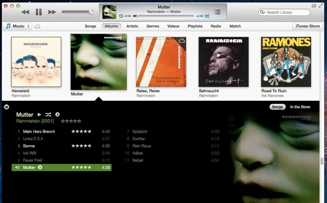
The Expanded View even detects the most noticeable color of the album cover and integrates it into the view. I used it on the appropriately titled channel Orange by Frank Ocean, which made my Expanded View... yup... orange.
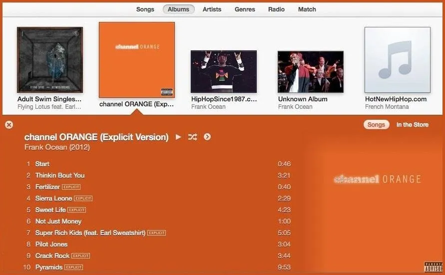
But where there are good things, there's also something bad. You see the following duplicate albums?
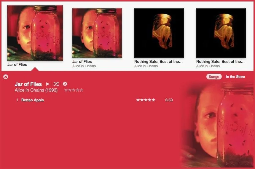
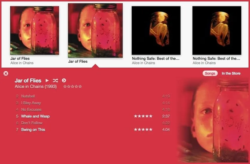


Weird, huh?
Before, I never noticed any duplicate albums, so this seems to be a new glitch to worry about. From what I can tell, it happens out of nowhere. There's no difference between the data seen in the info of each song—nothing that would make this happen on its own.
Some say that selecting all of your albums ("Select All" from the "Edit" menu), then right-clicking on the highlighted albums and choosing "Get Album Artwork" fixes the issue.

Not for me. I even tried doing them individually, but nothing worked. I tried deleting artwork for troublesome albums and then getting album artwork, but nothing. So, it wasn't artwork causing my separated albums.
But, there's always something else to try, and that's going to the Artist tab and finding the troublesome albums. Then, highlight all songs from the separated albums, right-click on them and hit "Get Info" (or just use the Command-I shortcut).
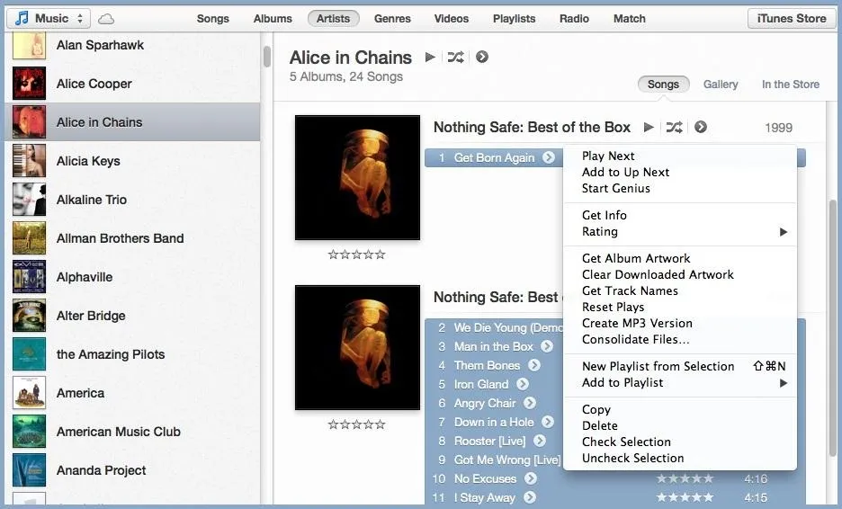
Then make the "Album Artist" all the same and it should fix the issue.
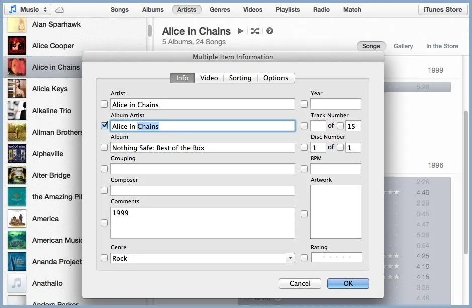
Kinda sucks, but you'll have to do it for each pair of separated albums.
Making Playlists Is Easier and Faster Now
Putting songs into playlists has never been easier in iTunes. Since the sidebar is missing, all you have to do is drag the song to the right of the screen. This will trigger iTunes to display your different playlists, which you can then drop your song into.
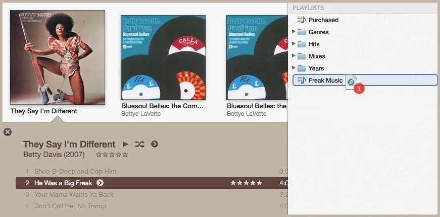
You can also click on the small arrow icon that appears next to the song title, click "Add To," then place it in the playlist of your choice.
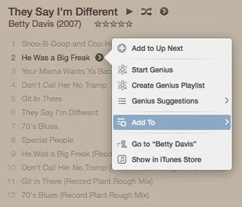
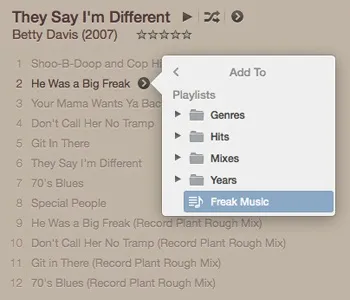


You can also bring back the side toolbar by clicking on "View" and selecting "Show Sidebar." That's Command+ALT+S for all of you shortcutters.
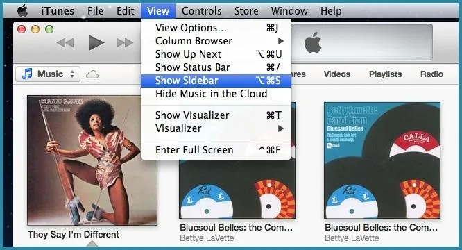
From there, you can drag songs to playlists like in previous iTunes versions.
Redeem iTunes Gift Cards with Your Webcam
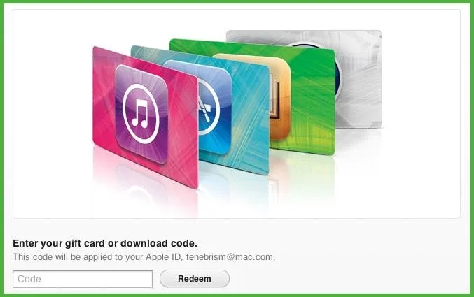
Another cool feature in iTunes 11 is the ability to redeem your iTunes gift cards by simply placing it in view of the webcam while it's on. This feature is definitely appreciated by those that hate typing in the long and difficult redeem codes.
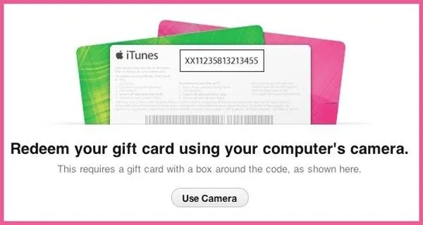
But the bad news—it's only available for Mountain Lion users. Anyone with Lion and below will still have to do it the hard way.
A More Functional MiniPlayer
The MiniPlayer has also been redesigned so that it isn't as cluttered, yet has more features. The simple, yet sleek user interface features an Up Next button...

Along with search and AirPlay options.

A Better Remote App for iPhone and iPad
The popular Remote app on the iPad and iPhone, which allows you to navigate your computer's iTunes remotely, has also been updated to work better with iTunes 11. The app features Up Next and the ability to add, delete, rearrange, and edit songs.


What do you like—or hate—best in the new iTunes 11? Let us know in the comments below!




Comments
Be the first, drop a comment!